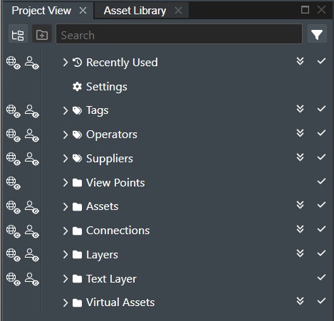
Project View
The Project View is a tree view representation comprised of all the various elements that makes up your project layout both uploaded data and online content e.g. Assets, Connections, Layers, 3D Surfaces, Wells, Map Servers and also access to the various global Project Settings.
For general information on how to use and navigate Project View, please read the Project View Functionality section.
Settings
The Settings section gives quick access to the various configuration settings for Connections, Dynamic Scale, Viewport, UI, and World Settings.
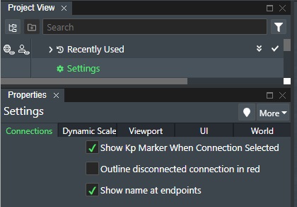
Connections
As shown in the illustration above, this setting applies to all connection types e.g. pipelines, umbilicals etc.
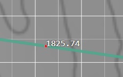
Show Kp Marker when connection selected - Check this setting to display the Kp point value next to the mouse cursor when moving along a selected connection:
Outline disconnected connection in red - Check this option if you want connection(s) in the Viewport to be displayed with red outline(s) if not fully connected for visual awareness.
Note! You will always see connections that are not fully connected denoted with red colors in the Project View.
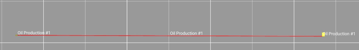
Show name at endpoints - Check this option if you want the name of the connection(s) displayed at each endpoint of a connection in addition to the the standard middle placement.
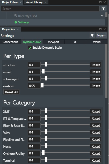
Dynamic Scale
The Dynamic Scaling is a function that improves rendition for field layouts to ensure better visibility for all assets, connections etc. when zooming out. This is especially useful for field layouts that spans great distances. When this function is enabled it will apply scaling that follows the zoom out function to retain visibility.
As an example, the screenshot below shows the field layout with Dynamic Scaling enabled.
The dynamic scaling feature thus ensures much better visibility overall for assets and connections when applied. You can apply this by Asset type or by Category.
Enable Dynamic Scale - Check this option to enable the dynamic scale rendering.
Per Type - Enabling the dynamic scaling per type e.g. Structure, Vessel, Submerged, or Onshore where you can apply the dynamic scale factor.
Per Category - Enabling the dynamic scaling by Category will allow you to select the category of asset to scale e.g. XMT, Template etc.
Use the horizontal slider to adjust the dynamic scale factor or enter the desired value in the range 0,01 to 5. Press the Reset button to revert to the default value.
Reset All - Press this button to return all values to default.
Viewport Settings
This allows you to define the Viewport background and grid colors. You can also enable the scale-bar and compass direction here and also control certain movement controls.
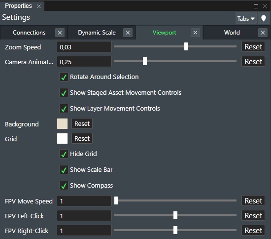
Zoom Speed - This numerical value defines the stepwise speed of which you zoom in and out of the Viewport. Useful if you are using trackpads or similar touch input devices for sensitivity control. The range is 0,001 as a minimum (slow) to 0,05 (fast). Press Reset to restore the default setting.
Camera Animation Speed - Controls the camera animation movement speed whhen clicking on a staged asset or a selection in the project list and moves to that location.
Rotate Around Selection - Enabled by default. If an object is selected the camera will rotate with the selection as the center. If disabled it will rotate around where you click in the Viewport.
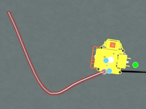
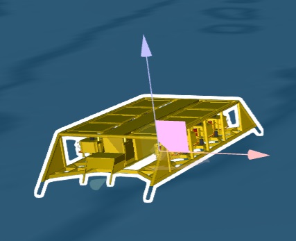
Show Staged Asset Movement Controls - Check this box to enable the additional 2d/3D axis movement controls for the staged asset in addition to just asset rotation as shown below:
Show Layer Movement Controls - Check this box to enable the additional 2D/3D axis movement controls for layer objects such as imported pictures etc.
Background - This is the default viewport background color. Click on the color picker to display the dialog where you can select the desired background color for your current sub-project. You can revert to default any time by clicking the Reset button
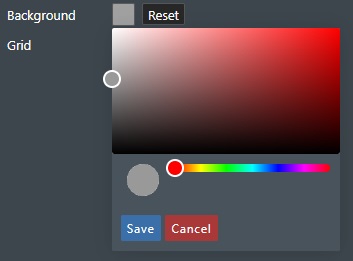
Grid - Click on the color picker to display the dialog where you can select the desired grid line color for your current sub-project. You can revert to default any time by clicking the Reset button.
Hide Grid - Check this option to turn off the grid display.
Show scale bar - Check this option to show the scale bar helper in the Viewport in 2D mode to better gauge distances.
Show compass - Check this option to show the compass rose directional helper in the Viewport in 3D mode to indicate spatial view orientation.
FPV Move Speed - Set the speed factor for the Flythrough Camera option. Value range is 0,01 to 1000. Click Reset for default value.
FPV Left Click - Set the left mouse click speed factor for the Flythrough Camera option. Value range is 0,01 to 2. Click Reset for default value.
FPV Right Click - Set the right mouse click speed factor for the Flythrough Camera option. Value range is 0,01 to 2. Click Reset for default value.
World Settings
These settings are rendering options where you can adjust water, seabed, fog, sun/shadow effects and also texturing.
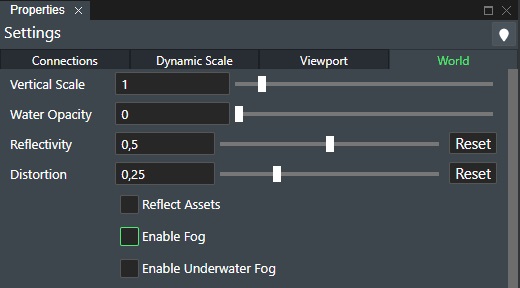
Vertical Scale - This will allow you to change the vertical scale only of the field layout for presentation purposes.
Water Opacity - The Opacity slider allows you to define the water transparency value from 0,1 to 1. Where a value of 0.1 is fully transparent and a value of 1 is completely non-transparent. Note! This applies to 3D view only. The default value is set to 0.
Reflectivity - This is used to increase or decrease the amount of light reflected from the water's surface, where 0 is not reflective and 1 is maximum reflectivity. This controls how strongly the sky is reflected in the water, as well as asset reflections if "Reflect Assets" is checked.
Distortion - This is a displacement amplitude factor determining how much distortion the reflections of objects in the water get.
Reflect Assets - This is a tick box which allows the assets to reflect off the water surface in the application.
Enable Fog - Check this box to toggle fog on and off which when selected shows additional options shown below:
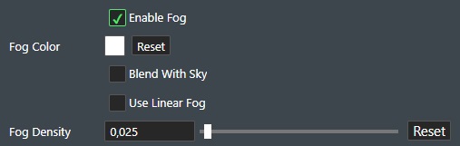
Fog Color - When the Fog tick box is checked the fog color option appears. This allows the fog color to be adjusted by clicking on the color box and then selecting the color and opacity needed for the fog visualisation.
Blend With Sky - Check this option to blend the fog with the sky texture.
Use Linear Fog - This is a tick box used to toggle linear fog on and off, when this is selected the Fog start and fog end sliding bars appear. The linear fog start and end are the distances from the camera where the fog begins and end, in other words where it goes from completely no fog, to 100% fog.
-
Fog Start - This defines the distance that the fog starts from 0 to 10000.
-
Fog End - This defines the distance that the fog ends from 0 to 100000.
Fog Density - This is a slider that defines the density composition of the fog effect, if linear fog is not enabled.
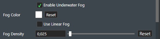
Enable Underwater Fog - Check this box to enable a fog-like effect underwater, which replaces regular fog when the camera is under the sea level. The additional settings shown are identical as described for regular fog above.
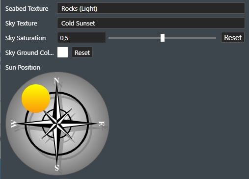
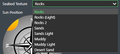
Seabed Texture - Use the drop-down list to select the default seabed texture for your project. Available selections are; Rock, Sand and Muddy options. You can type in your selection in the topmost search field to narrow down the options.
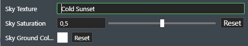
Sky Texture - This dropdown list allows the user to select how the sky in the 3D visualisation will look
-
Sky Saturation - Here you can set a value for how colorful the sky should appear. Assign a value between 0 and 1, or use the slider. Press Reset to set it to the default value.
-
Sky Ground Color - Use the color picker to assign a ground color to the skybox when reservoir mode is enabled to better differentiate colors in the render process so camera orientation is more intuitive.
The image below shows an example of how it could look.
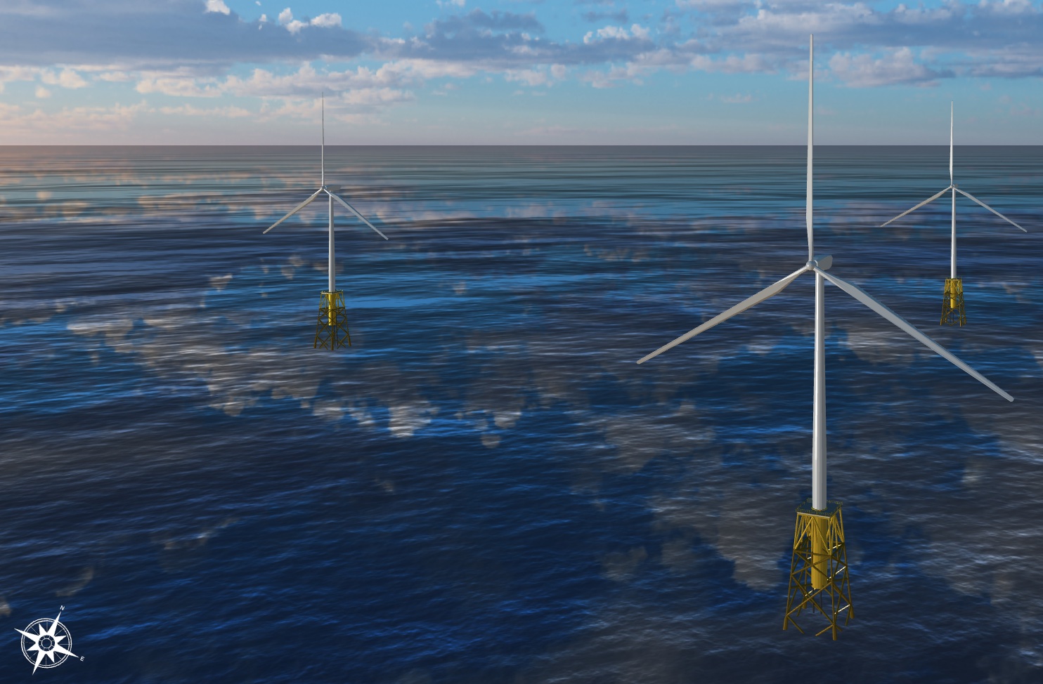
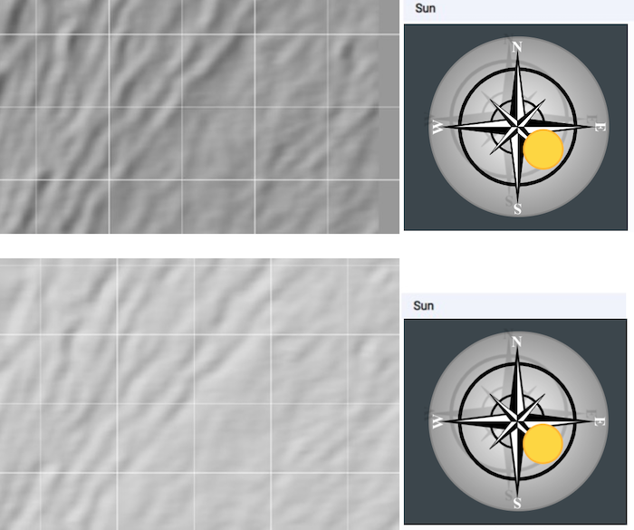
Sun position - This is a realtime hillshade simulation. A hillshade is a grayscale 3D representation of the surface, with the sun's relative position taken into account for shading the image. Applying hillshade lighting to Bathymetry will create a relief map of the bathymetry or landscape if you will that will provide better detail for deciding your field layout and pipeline routing. Applying the real time hillshade effect on the same bathymetry will yield another result that reveals much more detail about the actual topography e.g. seabed:
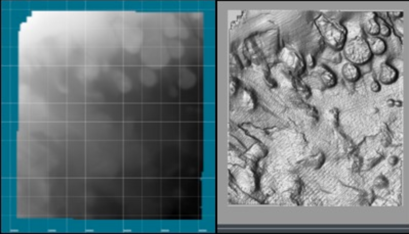
As you can see the relief map of the same bathymetry created in real time is now much more useful with providing geographical detail for especially your pipeline routing design as one example.
For this new feature to be effective you will need to load new or re-upload bathymetry to older projects as we compute a “Normal” map when converting the bathymetry data on the backend to achieve this effect. This effect works for both 2D and 3D view and you adjust the sun’s relative position in the “Settings” tab with the “Sun” dial.
Show Advanced Settings - Check this box to enter the advanced rendering options as shown here:
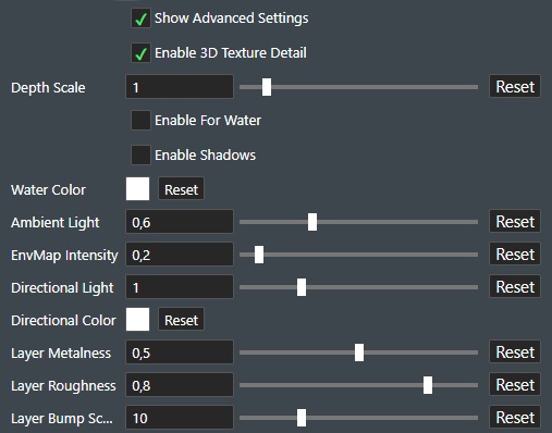
Enable 3D Texture Detail - Enables parallax mapping mode for shape textures or water.
-
Depth Scale - How deep the 3D effect is applied to the geometry. Range is 0 to 10. Press Reset to restore default value.
-
Enable for Water - Check this to enable the parallax mapping for water.
Enable Shadows - Check this to enable shadow mapping for the viewport. Allowing staged assets among other objects to cast shadow on the seabed.
-
Render Distance - Increasing render distance allows distant objects to have shadows, but with the trade-off that closer objects' shadows will have less detail. So it is important to adjust the render distance to fit your scene.
-
Resolution - The resolution can be increased to add detail, at the cost of slowing down the system.
-
Hard Edges - Soft edges usually give a nicer presentation when the resolution is low. But if you are e.g. taking a screenshot and have adjusted the render distance and resolution properly, enabling this can give a slightly harder edge look.
-
Enable ROV Mode - Enabling this adds two spotlights that follow the camera and cast shadows, similar to on an ROV, and disables the shadows cast by the sun. This is an option aimed at underwater scenes, where there’s often very little sunlight present.
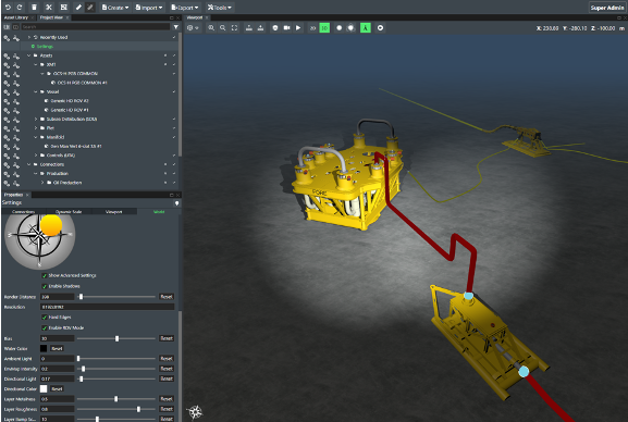
- Bias - Can be used to reduce potential graphical artifacts when using the shadow feature.
Water Color - The water color can be adjusted by clicking on the color box and then selecting the color needed for the visualisation.
Ambient Light - How bright the ambient background light is on a sliding scale from 0 to 2.
ENVMap Intensity - ENVMap intensity stands for environment map intensity, and is how much the sky reflects off of very smooth metallic staged assets.
Directional Light - This is used to adjust the light intensity from the Sun, this is controlled on a sliding scale from 0 to 4, with 4 being the most intense.
Directional Color - The directional light color can be adjusted by clicking on the color box and then selecting the color needed.
Layer Metalness - This is used on layer data to adjust how metallic the material looks in 3D
Layer Roughness - This is used on layer data to adjust how the material looks in terms of roughness in 3D
Layer Bump Scale - This scales the normal map used for computing lighting. This scale can be useful as it makes bumps in the terrain more clear, exaggerating the roughness of a layer.
Tags
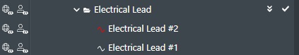
Any asset or connection can be tagged with a user defined name e.g. Drill Center #1, or in the sample illustration below imported connections are tagged with "simulation". This makes it easy to create groups. Every item that share the same tag is automatically put in a folder under the tags node in the tree.
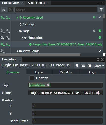
Using the tags functionality these grouped assets and/or connections can then all be selected by one click and you can perform operations such move, copy, delete, turn on/off, edit all common attributes, and finally easily mass edit common attributes. Tags are also accessible through the API.
Commands
If you right click on a Tag you will have the following commands available:
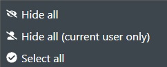
Hide all - This will hide any object(s) the tag is associated with, this is also true if this project is used in Linked Projects.
Hide all (current user only) - This will hide any object(s) the tag is associated with but only for your own user. Other user of the projects will still see the object(s).
Select all - Will select any object(s) in the Viewport that the tag is associated with.
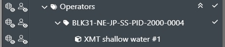
Operator
If you have added unique Operator Tags, which usually references unique Equipment IDs related to their other systems on Assets or Connections they will then also show up in Project View List as shown here:
Commands
If you right click on a Tag you will have the following commands available:
Hide all - This will hide any object(s) the tag is associated with, this is also true if this project is used in Linked Projects.
Hide all (current user only) - This will hide any object(s) the tag is associated with but only for your own user. Other user of the projects will still see the object(s).
Select all - Will select any object(s) in the Viewport that the tag is associated with.
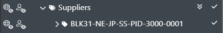
Supplier
If you have added unique Supplier Tags, which usually references unique Equipment IDs related to their other systems on Assets or Connections they will then also show up in Project View List as shown here:
Commands
If you right click on a Tag you will have the following commands available:
Hide all - This will hide any object(s) the tag is associated with, this is also true if this project is used in Linked Projects.
Hide all (current user only) - This will hide any object(s) the tag is associated with but only for your own user. Other user of the projects will still see the object(s).
Select all - Will select any object(s) in the Viewport that the tag is associated with.
View Points
You can create a View Point of the current scene view location in either 2D or 3D mode. You do this in the Create Menu. The created viewpoints will appear in the View Point section as shown here:
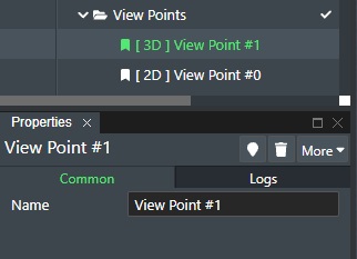
To navigate to a view point double click on the desired entry in the list. The View Points are prefaced with [2D] or [3D] which shows the view mode they were created in. Your viewport mode must match the viewpoint to be taken to that exact camera position.
You can also use View Points to set a Default View, which if set will be the current view when opening a project. You do this by right clicking the created View Point in Project View to bring up the context menu as shown below:
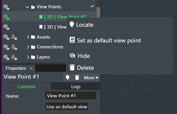
Note! You can also click on the Use as default view button in the property panel.
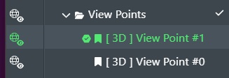
Once this is set you will see a checkmark next to it in the list of View Points in Project View:
The next time you open the project the View Port will display the 2D or 3D view specified by the default View Point.
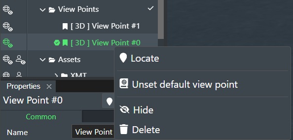
You can remove the default view point by right clicking the entry and selecting Unset default view point.
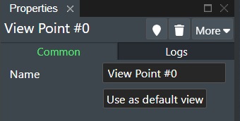
Common Tab
-
Name - Specify/change the name of the View Point here.
-
Use as default view - Click this to make this view point default.
Logs Tab
For an example of the logs tab that displays the latest 10 operation on the item in question.
See Logs Tab.
Commands
See Commands.
Assets
The Asset section is where you will find all the current staged assets for your sub project presented by category as shown here:
Asset Settings
In the Asset settings panel you have six (6) tabs, namely: Common, Cost, Asset, Metadata, Logs, and Documents.
Common Tab
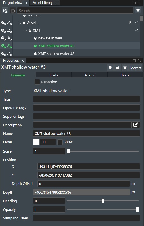
The Common Tab is comprised of all the available standard asset settings:
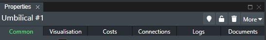
When you select an asset in the Viewport or in Project View then this common tab is shown. Available settings are:
Is Inactive - Check this box if the asset is not used in the project. It will then be marked in red, and no longer be available for any sort of operation or function.
Type - This displays the asset type definition.
Tags - Every asset can be tagged which makes easy to group Assets. See Tags.
Operator Tags - Enter an optional operator tag text string or number identifier for the asset. Typically used to link it with corresponding asset documentation, but will also show up Project Tree View.
Supplier Tags - Enter an optional supplier tag text string or number identifier for the asset. Typically used to link it with corresponding asset documentation, but will also show up in the Project Tree View.
Description - This optional field allows you to give a longer description for this asset. It can be used to add important supplementary information (E.g., for brownfield assets etc.). Click on the Pen icon to the right to open a dedicated input text dialog box for easier text entry.
Name - To change or name an asset simply enter the desired name in the text edit box. You can position the label on stage where you want by clicking it and then move it to the desired location.
Label - Set the text label properties here. Change the Color of the label text by using the color picker and the Font Size of the label by entering the font size. Check Show to display the asset name on stage.
Scale - It can be useful to scale an asset on stage up or down e.g. increase/decrease it from its original size to better depict realistic and relative sizes. You can now do this by simply selecting an asset and then input a new value in the "Scale" edit box. You can also increase/decrease the value by using the up/down arrow icons in the box when selected. The default scale size for an asset is usually 1.0.
Position - The position of the asset can be adjusted.
-
X - This shows the current X coordinate of the asset and can be changed in the edit field.
-
Y - This shows the current Y coordinate of the asset and can be changed in the edit field.
-
Depth Offset - This is the Z offset coordinate of the asset and can be changed in the edit field.
Depth - This is the actual Z coordinate of the asset and cannot be changed.
Heading - Shows the asset heading or rotation and can be adjusted when entering values between 0 and 359 degrees, or by using the slider.
Opacity - The Opacity slider allows you to define the asset transparency value from 0.1 to 1. Where a value of 0.1 is fully transparent and a value of 1 is completely non-transparent.
Sampling Layer - This will display a drop down list of the available 3D surfaces for the project that you can select for this asset to height sample on top off.
Note!
When you have multiple imported 3D surfaces you need to select which 3D layer to sample on for the asset. The default sampling layer will always be the lowest (most shallow) one.
Costs Tab
The Costs tab show the cost information for the selected asset:
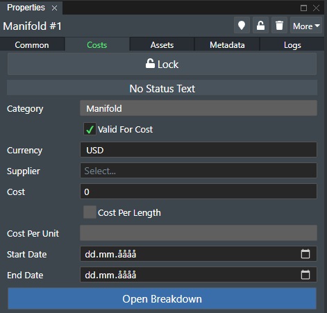
Padlock Icon - The padlock icon shows if the asset cost is locked or not. To change state simply click on the icon. If locked you cannot edit cost data for the asset.
Status Text - This will display status messages from cost server calculations if that is connected.
Category - Displays the asset category.
- Valid for Cost - Check this box if this asset is to be included in the Cost Module calculation.
Currency - To set the currency to be used for that specific asset, simply select it from the drop-down list.
Supplier - To define a supplier or vendor for the subsea asset or vessel, you can select one from the drop-down list. You can also simply start typing in the name in this field and if the supplier is not already defined in the database you will see a line with the option to Add the new supplier appear below the edit field as shown here.
Costs - To define the asset cost, simply assign a value in the cost field.
Cost per Length - If you have selected a connection you can supply a cost per length unit e.g. meter or feet. Check this box if you want to calculate cost per length. If this is disabled then this is not available for this selection.
Cost Per Unit - If you checked the option above, supply the unit cost number here e.g. cost per meter or feet.
Start Date - You can also specify a start date for the asset cost. This information will then be exported out to MS Excel if you use the Export function and can be useful when you work with CAPEX/OPEX calculations outside of FieldTwin Design.
End Date - You can also specify a start date for the asset cost. This information will then be exported out to MS Excel if you use the Export function and can be useful when you work with CAPEX/OPEX calculations outside of FieldTwin Design.
Open Breakdown - Press this button to break down asset cost into itemised parts and assigning individual cost for each sub part. This will display the dialog for assigning "Cost" for individual parts. Learn more about Additional Cost Breakdown
Assets Tab
In the Asset Property tab, you can change the individual asset settings and execute some asset commands as shown below:
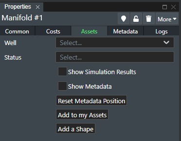
Well - If the selected asset support to be connected to Wells then this option will be displayed. Select the well from the drop down list that you want to connect to the asset.
Status - If you have created visual asset status definitions under the Account Settings for Asset Statuses then you can select them from the drop down list here and the asset outline color will change accordingly to reflect the selected status defined.
Show Simulations Results - This only applies to partner integration and in that case is in their documentation.
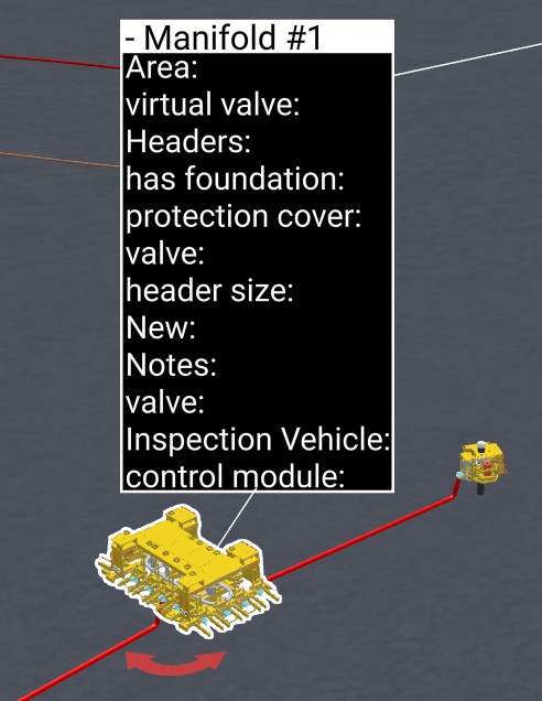
Show Metadata - Check this option to display the metadata information for the asset in the Viewport.
Reset Metadata Position - This reset the Metadata info box position to default.
Add to my Assets - Press this button to add this asset to your User Library folder in the Asset Library tree-view.
Add a Shape - Press this button directly to create and associate a shape around the asset instead of using the Create Menu to add a shape. The shape is then linked to the asset and will follow the asset around when you move it.
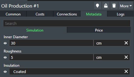
Metadata Tab
In the Metadata tab for the Asset you will see any defined Metadata options for the Asset so the user can do the asset configuration:
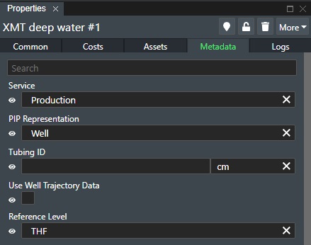
Eye Icon - Next to each metadata entry you will see an eye icon. Click this icon to toggle if that metadata entry should be shown/not shown in the Metadata Info box in the viewport if you have the Show Metadata option under Connection tab enabled.
The various options depend on how Metadata has been configured. See Metadata for more information.
Logs Tab
For an example of the logs tab that displays the latest 10 operation on the item in question.
See Logs Tab.
Documents Tab
In the Document tab for the selected asset(s) you can directly upload associated documentation for that asset to FieldTwin secure storage so it stays with the project and can be accessed any time it is needed. It also supports revsion handling of the same document. The Documents tab looks like this:
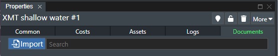
Import - Press this button to add a document for the selected asset. The following dialog will then be shown:
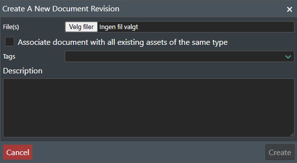
File(s) - Select the Choose files button to select the files you want to upload.
Associate document with all existing assets of the same type - Check this box if the document to be uploaded should be linked for all assets of the same type.
Tags - You can add descriptive tags here for the uploaded files.
Description - Add supplementary text if desired.
Press Create to upload the files to your FieldTwin Project, or Cancel to abort.
The uploaded file(s) will now be displayed in the Documents Tab as shown here:
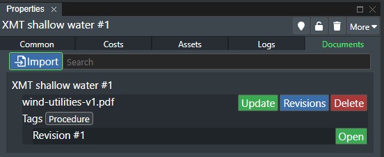
From here you can do the following:
Open - This button will open the file if the file format has a registered application on your computer.
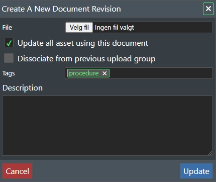
Update - Press this button, to update the document with a new version/revision. This will display the following dialog:
-
Choose File - Click on the file explorer dialog to select the document version/revision to upload.
-
Update all assets using this document - Check this box if you want to update this document for all assets you uploaded it for.
-
Dissociate from previous upload group - Check this box if you want the new upload document to break the association of the previous upload.
Press Update to continue, or Cancel to abort.
Revisions - Press this button to open the document revision dialog as shown here:
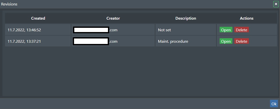
This will display a list of all the uploaded document revisions with information about date, creator, resources, and description.
-
Open - Click on this button for the revison list entry to view it.
-
Delete - Click on this button for the revison list entry to delete it. See Delete command description further down.
-
OK - Press this button the return to the main screen.
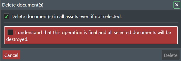
Delete - Press this button, to delete the document revision(s). This will display the following dialog:
-
Delete document(s) in all assets even if not selected - Check this box if you want to delete this document for all assets you uploaded it for.
-
I understand that this operation is final and all selected documents will be destroyed - You need to check this box to confirm the delete operation as this is not reversable. Once this is checked press the Delete button to continue, or Cancel to abort.
Asset Commands
See Commands.
Connections
The Connections section is where you will find all the current staged connections for your sub project presented by category as shown here:
Connection Settings
In the Connection settings panel you have seven (7) tabs, namely: Common, Visualisation, Costs, Connections, Metadata, Logs, and Documentation. Note! If no metadata is defined only 6 tabs will be displayed.
Common Tab
The Common Tab is comprised of all the available standard connection settings for the selected connection(s):
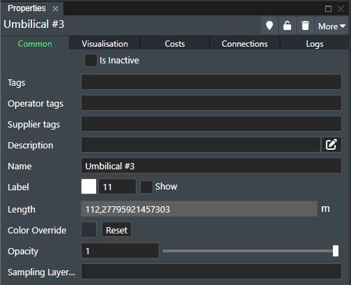
Available settings are:
Is Inactive - Check this box if the connection is not used in the project. It will then be marked in red, and no longer be available for any sort of operation or function.
Tags - Every connection can be tagged which makes it easy to group selections. See Tags section for more information.
Operator Tags - Enter an optional operator tag text string or number identifier for the asset. Typically used to link it with corresponding asset documentation, but will also show up Project Tree View.
Supplier Tags - Enter an optional supplier tag text string or number identifier for the asset. Typically used to link it with corresponding asset documentation, but will also show up in the Project Tree View.
Description - This optional field allows you to give a longer description for this connection. It can be used to add important supplementary information (E.g., for brownfield assets etc.). Click on the Pen icon to the right to open a dedicated input text dialog box for easier text entry.
Name - To name a connection simply enter the desired name in the text edit box. You can position the label where you want by clicking it and then move it to the desired location.
Label - You can change the Color of the label text by using the color picker and the font Size of the label by entering the value. Check the Show option to have the connection name displayed on stage.
Length - When you have selected a connection, the length of the connection in units will be displayed in Length field. At the end of the length field you will see the unit system e.g. metric or imperial. If you move an asset with a connection attached or edit the connection path the length will be automatically calculated and shown. The length field is automatically updated in both 2D and 3D View mode. Note! If the connection is not connected at both ends and is of design type None or Standard you can manually set the connection length using this field. Otherwise this field is greyed out. Be aware that because of floating calculation limitation the value can vary (≈ 0,002m).
Color Override - Connection colors are defined by default in the Account or Project Settings. But you can override this manually with this option. Click on the color picker to change the connection color manually. Press the Reset button to revert to default.
Opacity - The Opacity slider allows you to define the connection transparency value from 0,1 to 1. Where a value of 0.1 is fully transparent and a value of 1 is completely non-transparent.
Sampling Layer - This will display a drop down list of the available 3D surfaces for the project that you can select for this connection to height sample onto.
Note!
When you have multiple imported 3D surfaces you need to select which 3D layer to sample on for the connection. The default sampling layer will always be the lowest (most shallow) one.
Visualisation Tab
This allows you to add a dataset for visualisation of the connection itself to reflect the data you want visualised. Typical examples would be temperature or pressure data for the connection.
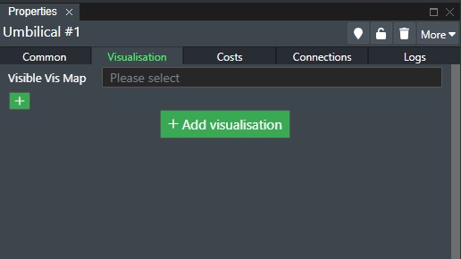
You can now also add visualisation datasets for Wells as shown below:
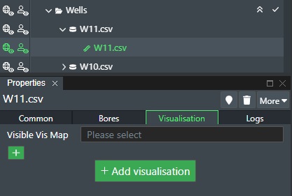
Visible Viz Map - Select the defined visualisation data set from this drop down list that you want to render. Note! Nothing will render unless you select a data set here.
+ Add visualisation - Press this button or press on the + sign to add a new visualisation dataset.
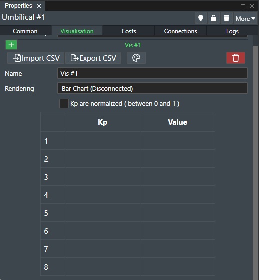
You can now use the following options to add/edit data and to change the connection visualisation rendering options:
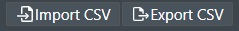
Import CSV - Press the left button as shown above to select a CSV (Comma Separated Values) file comprised of the KP point and the corresponding value for visualisation.
Export CSV - Press the right button as shown above to export a CSV (Comma Separated Values) file comprised of the current KP points and their corresponding values for visualisation.

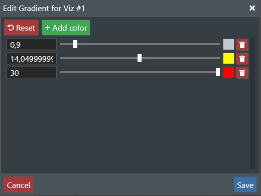
Color Gradient - Press the button as shown above to edit the color gradient values for the current visualisation data set as shown below.
Delete - Click on the red Trashcan icon to delete the current visualisation. You will be prompted for confirmation.
Name - Change/Edit the name of the current visualisation.
Rendering - Select one of the available visualisation methods from the drop down list. You can select between Bar Chart (Connected/Disconnected), Area Chart, or On Connection.
Kp are normalised - Select this option to normalise the values for the data value range.
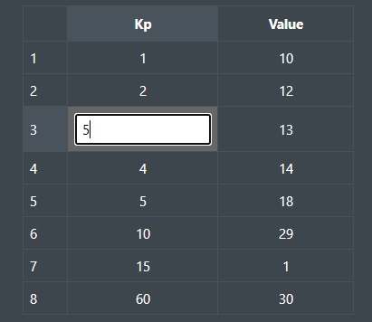
Edit Values - You can edit the KP and Value entries directly by clicking on the corresponding value in the table as shown above.
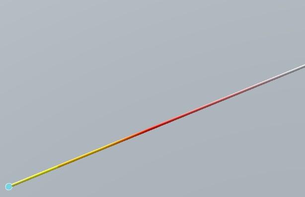
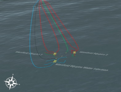
The illustration above shows the connection rendered with the On Connection option in 2D.
Costs Tab
The Costs tab show the cost information for the selected connection:
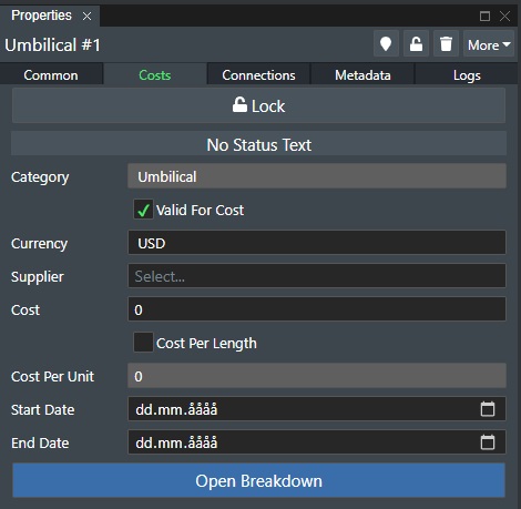
Padlock Icon - The padlock icon shows if the connection cost is locked or not. To change state simply click on the icon. If locked you cannot edit cost data for the connection.
Status Text - This will display status messages from cost server calculations if that is connected.
Category - Displays the connection category.
Valid for Cost - Check this box if this connection is to be included in the Cost Module calculation.
Currency - To set the currency to be used for that specific connection, simply select it from the drop-down list.
Supplier - To define a supplier or vendor for the connection, you can select one from the drop-down list. You can also simply start typing in the name in this field and if the supplier is not already defined in the database you will see a line with the option to Add the new supplier appear below the edit field.
Costs - To define the connection cost, simply assign a value in the cost field.
- Cost Per Length - Check this if you want the cost calculation to be per length unit e.g. meter or feet.
Cost Per Unit - If the Cost Per Length option is selected then you can supply the cost per length unit her to use for the cost calculation.
Start Date - You can also specify a start date for the asset cost. This information will then be exported out to MS Excel if you use the Export function and can be useful when you work with CAPEX/OPEX calculations outside of FieldTwin Design.
End Date - You can also specify a end date for the asset cost. This information will then be exported out to MS Excel if you use the Export function and can be useful when you work with CAPEX/OPEX calculations outside of FieldTwin Design.
Open Breakdown - You also have the possibility to break down connection cost into itemised parts and assigning individual cost for each sub part. To do this simply click on this button. Learn more about Additional Cost Breakdown
Connections Tab
The Connections Tab is comprised of all the available specific connection settings for the selected connection(s):
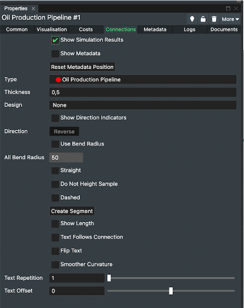
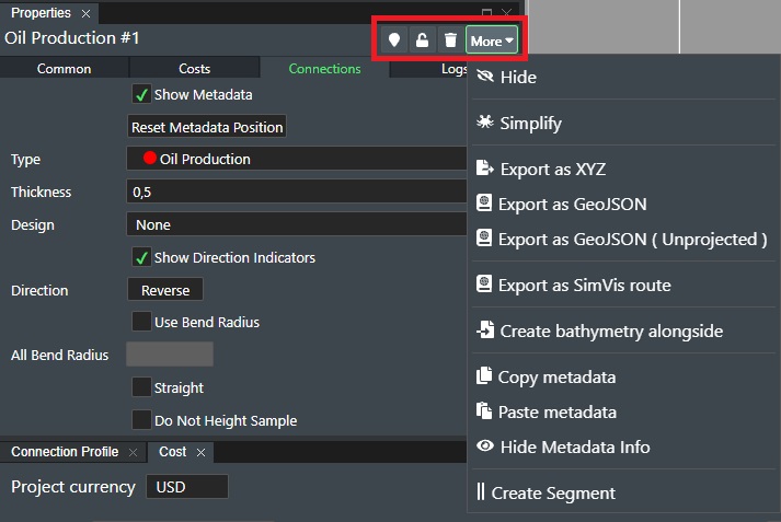
Show Simulation Results - This will display a text box showing custom results in the Viewport.
Show Metadata - This will display a text info box with all Metadata assigned to the connection in the Viewport.
Reset Metadata Position - Press this button to reset the position of the Metadata text info box to default.
Type - This shows the current connection type. To select a new type, simply click on the Type drop-down-list and select the desired one.
Thickness - You can also choose the connection line Thickness or Width on an individual connection by entering the desired numerical value in the edit field to the right.
Design - At present you can select between the following defined Connection Types: None, Jumper - Horizontal Z, Jumper - Vertical M, Jumper - Vertical N, Riser - Lazy Wave. If you have user defined types, they will also appear here. Please see the section Connection Types for more information on special connection types such as Risers and Jumpers.
Show Direction Indicators - Enable this option to display the Flow Direction on this connection. The direction is initially set when you connect a connection to an asset. The first connection you make is the From point and defines the flow direction. You will then see directional arrows signifying the flow direction for this connection.
Direction - Press this button to toggle the current flow direction.
Use Bend Radius - This enables the the bend radius tool and displays circles when a pipe or connection needs to have a bend. The pipe will then curve around the defined bend radius set in length units until it continues its path until the need for the next bend. The circles can also be freely positioned and moved around for design tweaking. For each such pipe design the system will remember all bend radius circles and will display them again when the pipe (connection) is selected so they can be further edited by the user.
All Bend Radius - Enter the bend radius value to use in length units e.g. metric or imperial. This value will be set for all bends.
Straight - This will force the connection to be rendered as straight line e.g. it can't be curved.
Do Not Height Sample - Check this if you have e.g imported connections or connections between subsea structures that you do NOT want to follow the seabed.
Dashed - The dashed line pattern option allows you to toggle between a dashed or solid line type for the selected connection.
Create Segment - Press this button to add a segment to the connection. Please see Segments for more information on how to use this feature.
Show Length - Check the box to have the connection length in units (metric or imperial) displayed on stage. The length label can be freely repositioned on stage simply by selecting it and then move it around.
Text Follows Connection - Select this option to have the text label following the connection path.
Flip Text- Select this option to reverse the direction of the text.
Smoother Curvature - Enable this option to render the connection curvature more smoothly as this will add more rendering points.
Text Repetition - This is a numeric value representing the number of times the connection length will be displayed distributed along the connection. Enter a number in the edit field or use the slider to change the value. Note! - Only applies if the Text Follow Connection option is selected.
Text Offset - This is numeric value in the range (-1 to 1) representing the starting point offset for the Connection Length text rendering for better adjustment of the text.
Metadata Tab
In the Metadata tab for the selected connection(s) you will see any defined Metadata options for the connections so the user can do the configuration selection:
Eye Icon - Next to each metadata entry you will see an eye icon. Click this icon to toggle if that metadata entry should be shown/not shown in the Metadata Info box in the viewport if you have the Show Metadata option under Connection tab enabled.
The various options available depends on how Metadata has been configured. If no Metadata has been defined this tab will not be displayed. See Metadata for more information.
Logs Tab
For an example of the logs tab that displays the latest 10 operation on the item in question.
See Logs Tab.
Documents Tab
In the Document tab for the selected connection(s) you can directly upload associated documentation for that connection to FieldTwin secure storage so it stays with the project and can be accessed any time it is needed. It also supports revsion handling of the same document. The Documents tab looks like this:
In the Document tab for the selected asset(s) you can directly upload associated documentation for that asset to FieldTwin secure storage so it stays with the project and can be accessed any time it is needed. It also supports revsion handling of the same document. The Documents tab looks like this (Note! Screenshots from asset tab):
Import - Press this button to add a document for the selected connection. The following dialog will then be shown:
File(s) - Select the Choose files button to select the files you want to upoload.
Tags - You can add descriptive tags here for the uploaded files.
Description - Add supplementary text if desired.
Press Create to upload the files to your FieldTwin Project, or Cancel to abort.
The uploaded file(s) will now be displayed in the Documents Tab as shown here:
From here you can do the following:
Open - This button will open the file if the file format has a registered application on your computer.
Update - Press this button, to update the document with a new version/revision. This will display the following dialog:
-
Choose File - Click on the file explorer dialog to select the document version/revision to upload.
-
Update all assets using this document - Check this box if you want to update this document for all assets you uploaded it for.
-
Dissociate from previous upload group - Check this box if you want the new upload document to break the association of the previous upload.
Press Update to continue, or Cancel to abort.
Revisions - Press this button to open the document revision dialog as shown here:
This will display a list of all the uploaded document revisions with information about date, creator, resources, and description.
-
Open - Click on this button for the revison list entry to view it.
-
Delete - Click on this button for the revison list entry to delete it. See Delete command description further down.
-
OK - Press this button the return to the main screen.
Delete - Press this button, to delete the document revision(s). This will display the following dialog:
-
Delete document(s) in all assets even if not selected - Check this box if you want to delete this document for all assets you uploaded it for.
-
I understand that this operation is final and all selected documents will be destroyed - You need to check this box to confirm the delete operation as this is not reversable. Once this is checked press the Delete button to continue, or Cancel to abort.
Connection Commands
See Commands.
Connection Points
When you are editing Connection Points you will find the associated setting pages in Project View when you select the point you want to edit as shown here:
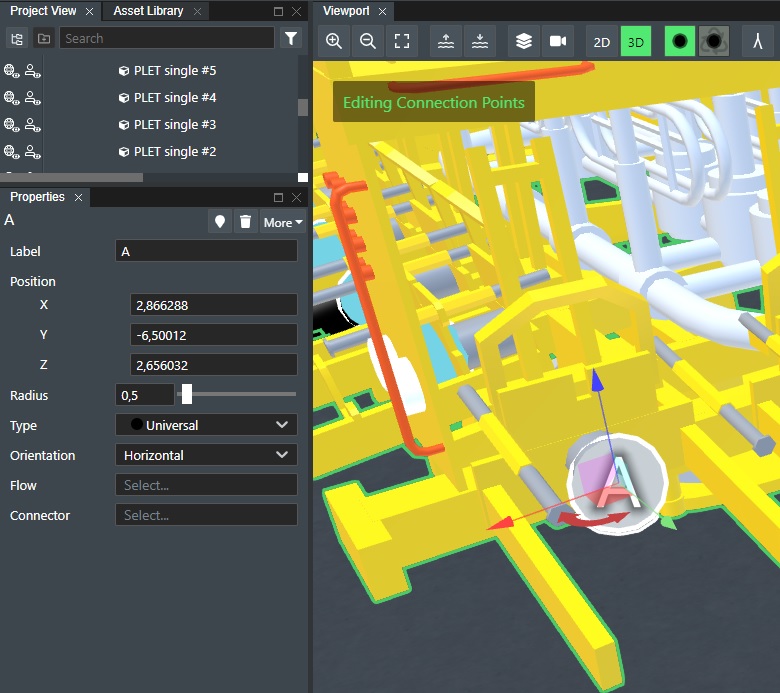
Connection Point Properties
In the Connection Point settings panel you have two (2) tabs, namely: Properties, and Metadata if any metadata are defined on the point.
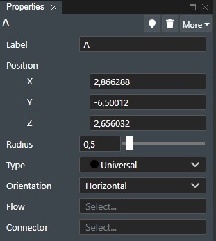
Label - This allows you to name the connection point with a text string to designate details that can be useful for internal routing, type of connection point such as "O" for Oil Production, etc.
Position - The position of the connection point can be adjusted.
-
X - This shows the current X coordinate of the connection point and can be changed in the edit field.
-
Y - This shows the current Y coordinate of the connection point and can be changed in the edit field.
-
Z - This shows the current Z coordinate of the connection point and can be changed in the edit field.
Radius - Use the slider or the edit box to change the value for the radius of the connection point as shown in the Viewport.
Type - Select the connection type that can be connected to this point from the drop down list. Universal will allow you to connect anything, but when you select another defined type only that type e.g. Oil Production can be connected to the point.
Orientation - Select if this should be a horizontal or vertical connection.
Flow - Select if the connection point should be of type Inlet or Outlet for the flow.
Connector - Select which set of Metadata to use for this connection point. These are defined under the Account Settings > Connector.
Layers
The Layers section is where you will find all the uploaded content or online data sources for the project/sub-project such as Pictures (2D imagery), 3D Surfaces (Bathymetry, reservoir scans etc.), and WMS (connected WMS map servers):
Pictures
The Pictures section is where all 2D images you have uploaded.
Read more here in the corresponding Create Picture section.
3D Surfaces
The 3D Surfaces section is where you will find all the 3D Surfaces (Bathymetry, surveys, reservoir scans etc.) you have uploaded.
Read more here in the corresponding Create 3D Surface section.
WMS
The WMS section is where you will find all connected WMS (Web Map Service) servers you have configured.
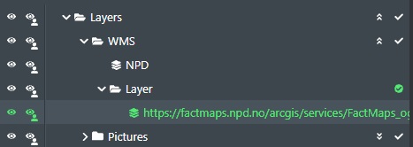
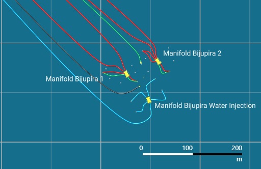
This allows you to connect and use a WMS as a content layer in the 2D stage mode e.g. show license maps, existing pipelines etc.
Read more here in the corresponding Create WMS section.
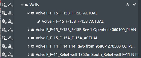
Wells
The Wells section is where you will find all uploaded or created well trajectories and well bores.
Read more here in the corresponding Create Wells section.
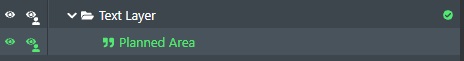
Text Layer
The Text section is where you will find all free text annotations created.
Read more here in the corresponding Create Text section.
ProjectView Functionality
In Project View that uses a tree-view structure to display all project data and content you have certain general functionality that is available for all layers or folders if you will. This goes to controlling visibility, using commands, multi-selection etc.
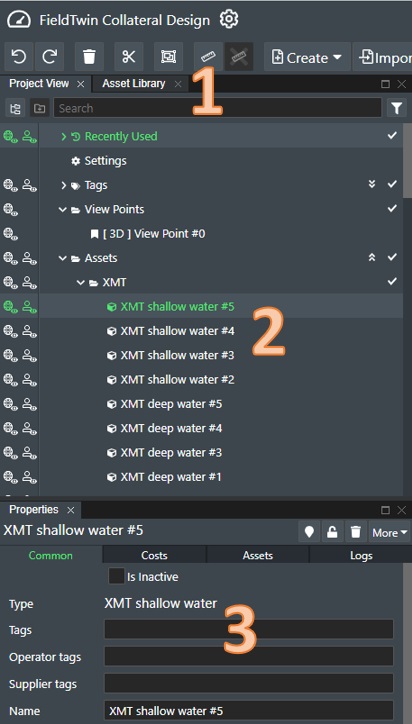
The illustration above shows the Project View Tab (1), the project view content tree structure area (2), and the associated information section (3) with all the associated property pages for your selection.
Navigation
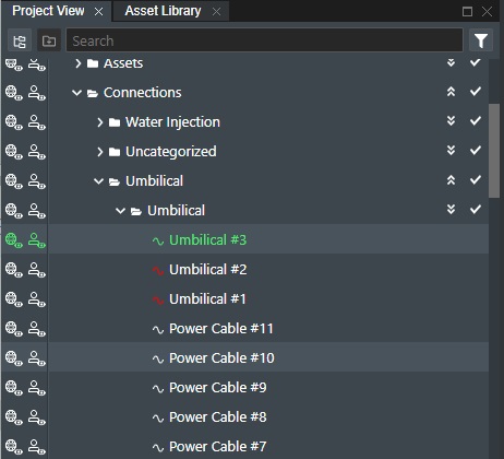
You navigate the tree structure by clicking on a desired content folder. This will then open and expand to show the content or close and collapse based on the current state. The icons will also change accordingly:

If you click on the line with the ">" symbol and the Asset Folder name it will then expand and show the content. Note! You can have nested levels of content.
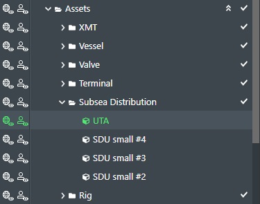
As you can see the Assets folder has several folders inside that represents the various asset types that have been used in the project. To any of these nested folders simply click on them as you did for Assets. To close any folder, simply click on it again.
Custom Tree-View
If you want a custom configuration of the Project View default tree-view you can also build your own custom tree-view and categorise items in to better fit your workflow/layout needs. You can also use both configurations, and easily switch from one to another. Note! If you activate this option the default folder definitions from FieldTwin Design will not be shown and all items in Project View will just be listed so you can rearrange them into your custom folder structure.
In the top left corner of the Project View you will see the following icons:

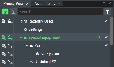
Click on the leftmost icon to activate the custom tree layout. This will highlight the icon in green to indicate that the custom tree mode is active:

Click this icon again to revert to default!
This allows you to click on the Create Folder icon to add a new custom folder. The following dialog will be presented:
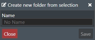
Type in the name of the new folder e.g. Special Equipment and press the Save button to create it. Note! You can of course create nested folders.
Drag and drop
After you have created your custom tree view structure you can now simply drag and drop any item in Project View into your custom folders and structure it as you like:
Selection
To select a folder entry, simply click on it and it will change color to green as shown here:
This will then also populate the associated data in the information section (3) under the tree view window.
To multi-select several entries, you can use the following keys together with the mouse selection:
| Key | Command |
|---|---|
| CTRL | Add individual entries clicked on |
| SHIFT | Add all items from selection to the clicked entry |
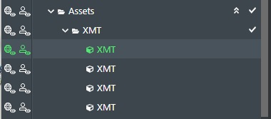
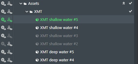
So holding down the CTRL key and clicking on additional entries selects these:
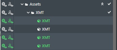
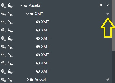
You can also use the Checkmark icon to select all entries in a folder:
Simply, click on the checkmark icon as indicated by the arrow in the illustration above. This will then select all entries in that folder:
To unselect all simply click it again.
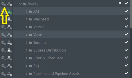
Visibility
There are two (2) different object visibility controls icons available in project view signified by the world + small eye icon and the person + small eye icon next to each other as illustrated above:
The leftmost World+eye icon will toggle the list item visibility on/off when you click it and it is the current project setting for what is visible in the Viewport. If you turn off visibility of an object (asset, connection etc.) here it will then not be visible for any other users in that project either.
Note! This is also true if your project is part of a Linked Project so when making an object not visible here means that it will also not be visible for any project the current project is linked into!
The rightmost Person + eye icon is controlling visibility per user only. If you use this on any object it will toggle the visible/non visible state, but only for your own user. It is important to note the difference between these two options as the first affects all users, whereas the latter is just controls visibility for yourself.
You can also turn the entire layer/folder visibility on and off by clicking the corresponding World/Eye or Person/Eye icon to the left of the corresponding layer folder. Click again to toggle the state back.
Commands
All content items in the project view folders (connections, assets, etc.) have a set of common and selection specific commands that are available to be executed. You can access these commands in two ways.
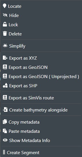
If you right click on a selected entry or selection of entries in project view or in a Viewport selection, a menu of available options will be displayed as shown here with the top item designating the number of selected entities. This illustration shows the commands for a connection:
These options are also available in the Properties section represented by the icons and the "More" menu as shown here highlighted in red:
The commands that are available varies based on the type of asset, surface, etc. you have selected. The available commands are as follows:
General commands
Locate - This will locate the selection(s) on the Viewport. You can also just double click on an entry in project view to do this.
Hide/Show - Hides/Shows the selection(s) in the Viewport. Same as clicking on the corresponding eye icon.
Lock/Unlock - This will lock the selection(s) on stage so it can't be moved, deleted or have its metadata edited. Note! If you project is part of a linked project the lock/unlock function is only available in the parent project itself.
Delete - Deletes the selection(s).
Copy Metadata - Copy the associated metadata from the selection(s). See Metadata.
Paste metadata - If you have copied metadata from other similar selection(s), select this command to paste it to the new selection(s).
Hide/Show Metadata info - Hides/Shows the Metadata Info box in the Viewport.
Asset Commands
Export as SHP - This will create a Shape file with the asset represented as a box outline with the associated coordinates that you can load up in another application. The file will be stored as a ZIP archive in your download folder. Note! For SHP and GeoJSON staged assets are now exported as an oriented box outline.
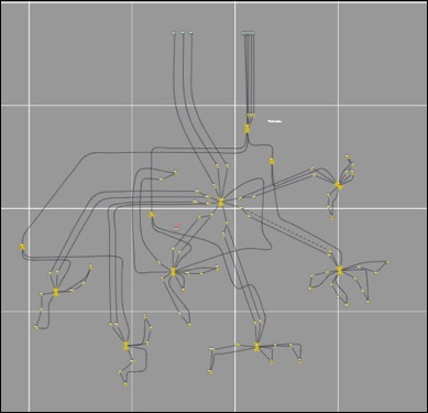
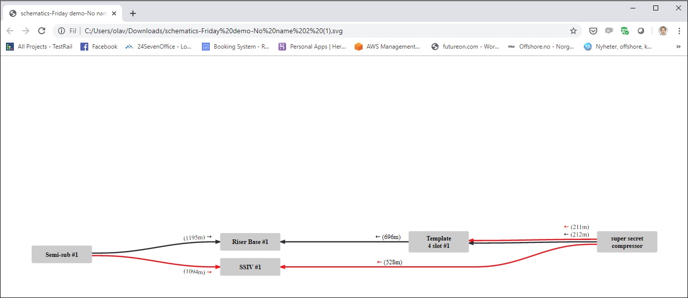
Generate Schematic From Here - This will generate and save out a network schematic with this asset as the master node. The file will be saved as a SVG in your download folder. You can open this in your browser or in an application such as Photoshop. See illustration below:
Copy Sockets - This will copy the defined socket information for this asset into memory.
Paste Sockets - This will paste the previously copied socket information in memory into this asset.
Connection Commands
Simplify - Select this option to run a simplification algorithm on the connection(s) in the project by removing the number of intermediate points to improve performance.
Export as XYZ - This function will export the selected connection(s) or well(s) as a text file in X,Y,Z format.
Export as GeoJSON - This will export the selected connection(s) or well(s) in GeoJSON format.
Export as GeoJSON (Unprojected) - This function will export the selected connection(s) or well(s) in GeoJSON format without any coordinate projection conversion.
Export as SimVis Route - The SimVis route file(s) will then be stored in your download folder as a .rcp extension file or a zip file if multiple connections are selected. This function will export a single connection or a selection of connections when selected by right clicking a connection in Project View and choosing this option. The SimVis route file(s) will then be stored in your download folder as a .rcp extension file or a zip file if multiple connections are selected.
The SimVis rote will be formatted as follows and has an entry for each control point on the selected connections:
*SimVisRouteControlPoints-3.00

[Settings]
coordsUTM = yes
hasDepthValues = yes
hasRadius = no
visible = yes

[Coordinates]
228.0799702012059   105.71184878957986  undefined
220.52476799391346  16.230976717349368  -300
176.17690717434618  10.597694410943902  -300
Export as GLTF - This function will export a single shape or a selection of shapes in GLTF format when selected by right clicking shape(s) in Project View and choosing this option.
Export as SHP - This function will export a single shape or a selection of shapes in ".SHP" file format when selected by right clicking shape(s) in Project View and choosing this option.
Export as Continuous XYZ - If you have selected two (2) or more connections along the same directional path typically with asset(s) in-between, you can select this option to export the connection x,y,z coordinates into a single file with continuing with the x,y,z data for each selection after each other.
Create Bathymetry alongside - This will launch the Create 3D Surface dialog box with this connection selected for reimporting bathymetry following the connection profile in higher resolution. See Create Menu.
Create Segment - This will create a new segment for the connection. Read more here Connection Segments
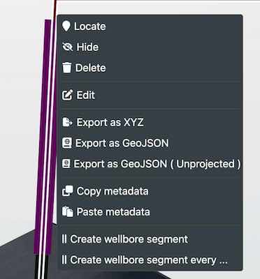
Well and Wellbore Commands
Edit - Brings up the Well Editor dialog.
Import Bore - Allows you to import a well bore trajectory asa text file with XYZ coordinates.
Export as XYZ - This function will export the selected well(s) as a text file in X,Y,Z format.
Export as GeoJSON - This will export the selected well(s) in GeoJSON format.
Export as GeoJSON (Unprojected) - This function will export the selected well(s) in GeoJSON format without any coordinate projection conversion.
Create Wellbore Segment - This is used to visualize well components along a wellbore, such as casing or completetion design.
Create Wellbore Segments every... - This allows the user to create a group of segements every so many metres or feet to quickly build out your well.
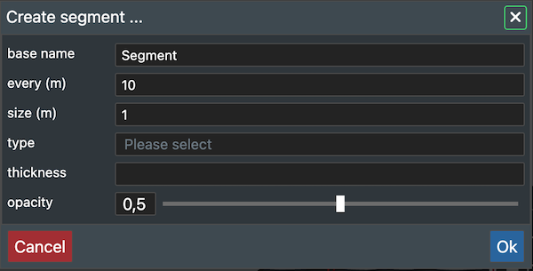
Well segments
To create more than one segment you can right click on the wellbore and click on the create wellbore segments every.... Here you can select the segment distribution, size (length), type, thickness and opacity.
Layers Commands
When you right click on a layer in Project View the context menu will present the relevant available commands such as here when right clicking on a 3D Surface:
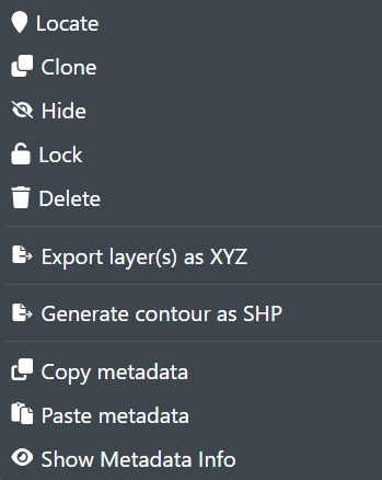
Most of these are common commands, but the layer specific ones are:
Configure WMS . This is available when the selected entry is in the WMS Layer. Brings up the WMS Configuration dialog.
Export Layer(s) as XYZ - This is available when the selected entry is in the 3D Surfaces Layer. This will display the following dialog:
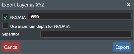
-
NODATA - When checking this option, the value specified will be use to remove points that have the exact same depth value.
-
Use maximum depth for NODATA - Check this option to use the maximum depth for the loaded layer data in the export.
-
Separator - Input the ASCII character you want to use the separate the X,Y,Z values. Press Export to save the file to your download folder, or Cancel to abort.
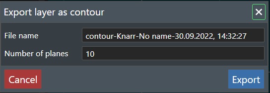
Generate Countour as SHP - This will generate a countour map of the 3D seabed (bathymetry) and save it as SHP file, which you can then load up in another application. This will display the following dialog:
-
Name - Enter the filename you would like. The file will be stored as a ZIP archive file in your Downloads folder.
-
Numer of Planes - This is the number of countor planes you would like. If e.g. the seabed has a 50 m elevation then using 10 will create a countor line for every 5 meters. The output will then look like this:

Logs tab
The log section will show the last 10 operations for the selected object (asset, connection, etc.), layer or folder as the example below illustrates:
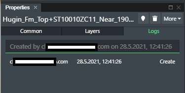
This displays the following columns with information:
User - The email of the user that made the change.
Date - The date and time of the change.
Keys - The operation that was performed.